
TO ENJOY DESIGNING FOR A WOMEN AND MINORITY OWNED BUSINESSES WHILE SHOWING OFF EACH OF THEIR PERSONALITIES.
TO ENABLE MY DESIGN TO BE MORE INTENTIONAL WITH EACH CREATION I MAKE BASED ON THEIR UNIQUE DNA.
MY EMPATHY FOR YOU TAKES THE WHY AND WHAT OF YOUR BUSINESS TO TURN IT INTO HOW YOU AUDIENCE SEES YOU
THATS MY SUPERPOWER!
FINDING YOUR UNIQUE BRANDING FOR YOUR NICHE BUSINESS. MAPPING OUT YOUR VISION SO YOU CAN HEAD DOWN THE ROADWAY TO SUCCESS.
MY MISSION: TO ILLUMINATAE THE VISION YOU SEE FOR YOUR BUSINESS. BY TAKING YOU THROUGH MY SIGNATURE TLC PROCESS. BECAUSE YOUR BRAND IS AN EXTENSION OF YOU
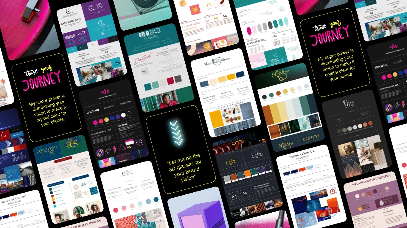
A Brand is what people think and feel about a company or product. It’s like how you feel when you hear your favorite song or see your favorite character. Everything about a company or product, like how it looks , what it says, and how it acts, all help to make up its BRAND. A logo is just one part of a bigger thing called Branding. Similar to how the album cover is just one part of a song or story.
The Challenge
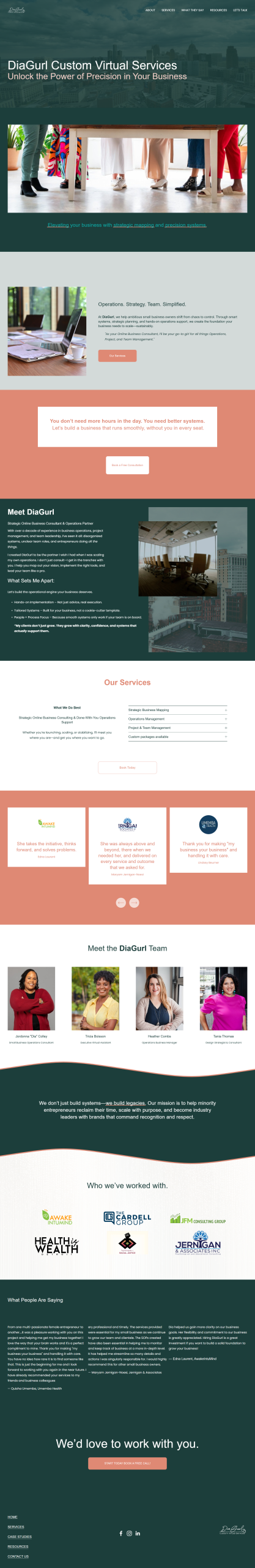
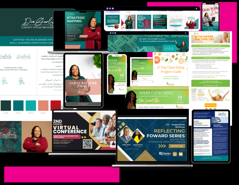
DiaGurl came to us with a bold vision: to build a boutique business operations consulting firm that felt elevated, efficient, and distinctly female-powered. With a focus on Strategic Mapping, Business Strategy Planning, and cross-client operations support, DiaGurl needed a cohesive brand presence that could scale across multiple industries while remaining rooted in credibility, clarity, and class.
She needed more than just branding—she needed a design partner who could support her growing roster of clients with everything from visual branding and event assets to document templates and marketing materials.
The Strategy
We designed a brand system for DiaGurl that reflected executive-level polish with a modern, approachable twist. Think “boardroom brilliance meets bold creative edge.” The color palette of deep teal, vibrant red, and soft coral struck the perfect balance between confidence, warmth, and sophistication.
Core Deliverables:
Visual Identity
A clean logo inspired by signature and technology. Paired with bold sans-serif type and a crisp layout system, DiaGurl’s identity feels both organized and effortlessly chic.
Color Story
Teal: Strategy, trust, and focus
Red: Power, momentum, decision-making
Coral: Warmth, creativity, and client connection
Brand Voice
Empowered, sharp, and consultative. Messaging reflects her role as both leader and partner: “Let’s architect your backend brilliance. From team workflows to launch strategy—I’ve got you.”
Templates & Collateral
We developed a full suite of plug-and-play business assets:
Ongoing Creative Support
As DiaGurl’s design consultant, we implemented an agile workflow to manage her client design needs across multiple niches, ensuring brand cohesion for each, while maintaining DiaGurl’s high-end standard of excellence.
Case Study: DiaGurl – Strategic Online Business Consulting & Operations Support
Client: DiaGurl
Industry: Online Business Consulting / Operations Management
Tagline: “As your Online Business Consultant, I’ll be your go-to girl for all things Operations, Project, and Team Management.”
Objective: Full Brand Kit Development + Ongoing Design Consulting

The Result
DiaGurl now leads with a visual presence and toolkit that matches her operational brilliance. Her brand is attracting high-value clients who are not only drawn to her strategy expertise but also trust the polished, professional experience she delivers across every interaction.
Her new identity isn’t just beautiful—it’s a fully functional system designed to grow with her, scale across client industries, and uphold her brand promise: streamlined, stunning, and strategically sound.
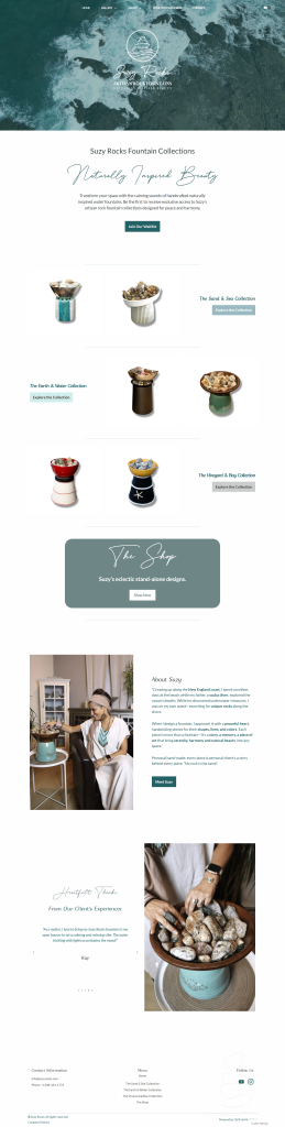
Case Study: Bagaboos – A Vegan Luxury Candle Brand
Client: Bagaboos
Industry: Vegan Luxury Lifestyle
Tagline: “Immerse yourself in Luxury. Treat your senses to our decadent candles.”
Objective: Full Brand Kit Development
The Result
Bagaboos launched with a distinct, memorable presence in the luxury market, focused on grabbing the attention of boutique retailers and lifestyle influencers. The brand’s commitment to ethical luxury, combined with a uniquely sultry aesthetic, sets it apart in a crowded market, proving that conscious can also be captivating.
The Challenge
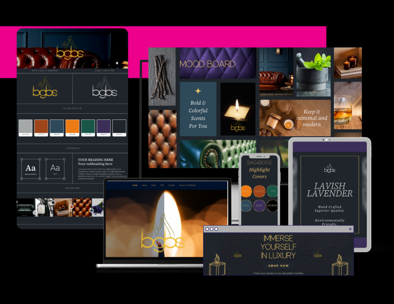
Bagaboos approached us as a new entrant in the luxury candle market, aiming to blend sustainability with sensual sophistication. Their unique edge? 100% vegan, cruelty-free candles designed to evoke the mood of a high-end bar and smoke room—moody, indulgent, and unmistakably luxe. They needed a full brand identity that would resonate with affluent, style-conscious consumers while staying true to their ethical roots.
The Strategy
Our approach was to craft a brand universe that seamlessly merged opulence with edge. Drawing inspiration from cigar lounges, velvet-soaked speakeasies, and modern art deco design, we established the following core elements:
Visual Identity
A rich, smoky color palette of deep charcoals, mahogany, warm golds, and muted burgundy to reflect the warmth and depth of candlelight in a luxury lounge setting. Typography mixed sharp serif logotypes with sleek sans-serifs for contrast and sophistication.
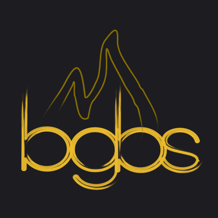
Logo Design
We designed a minimalist emblem that hints at rising smoke—a nod to both the candle’s essence and the ambiance of an exclusive smoke room. The wordmark “bgbs” was custom-lettered to feel timeless and tailored.
Brand Voice
Bold, evocative, and indulgent. Messaging leaned into the sensory journey of lighting a Bagaboos candle—“Whiskey warmth. Velvet shadows. Leather and fig. Welcome to your escape.”
Collateral
A full suite of assets: brand guidelines, social media templates, and candle scent labels with dramatic lighting and smoky textures.
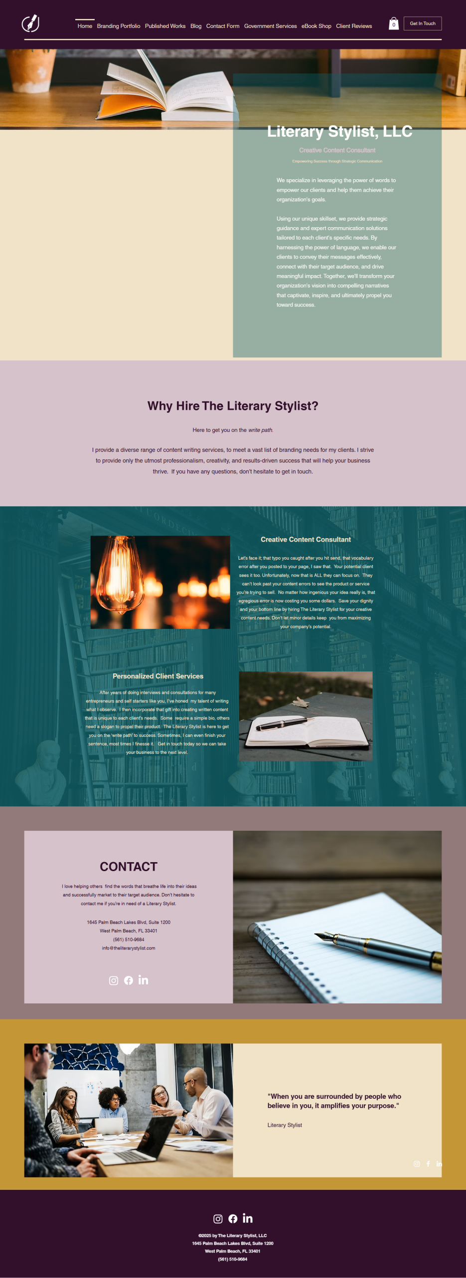
The Challenge
No branding.
No cohesive visual identity.
And a DIY website that would have faded into the background.
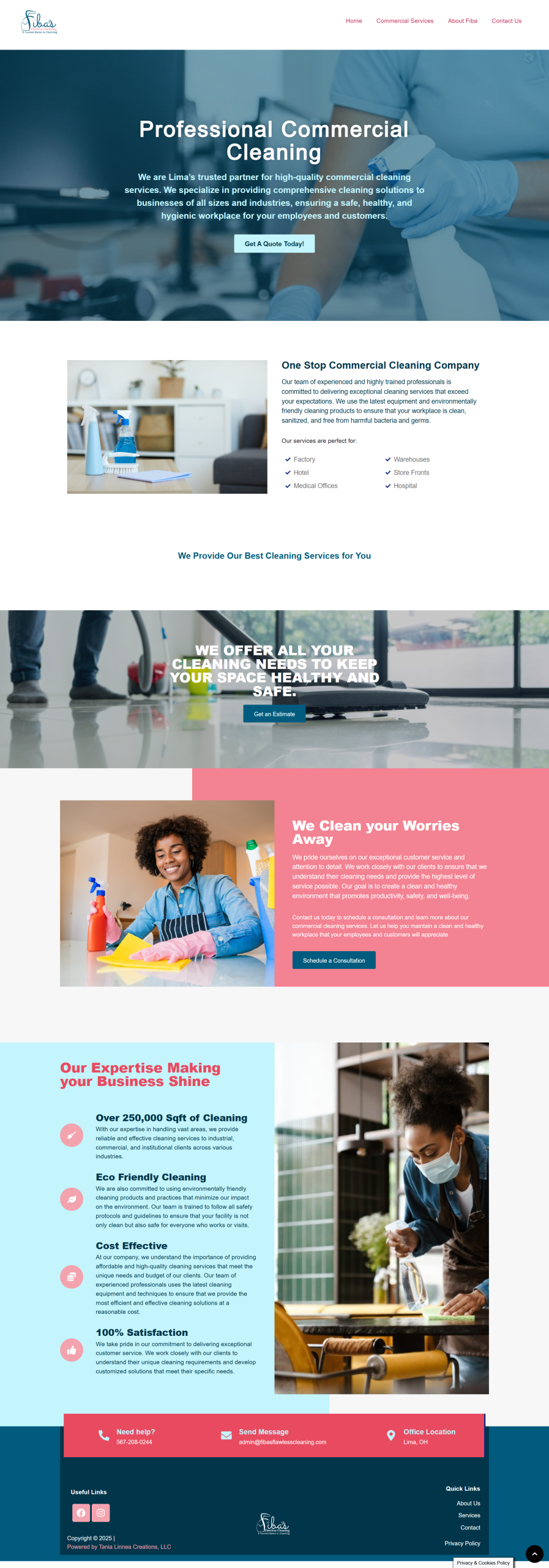
Fiba’s needed more than just a logo—they needed clarity, confidence, and a brand presence that matched their professionalism and growth.
The Strategy
We started from scratch. Together, we developed a brand identity rooted in trust and polished professionalism, with just the right touch of feminine energy.
Phase 1: The Foundation
Custom Logo Design – Sleek, confident, and professional, the new logo gave Fiba’s Flawless Cleaning a recognizable face.
Brand Color Story – We swapped uninspired oranges and browns for a refreshing, modern palette: soft pinks, aqua, and deep teal blues—colors that signal cleanliness, care, and capability.
Tone of Voice – Clean, clear, and confident—just like their work.
Phase 2: The Glow Up (Years Later)
As the business grew, so did the brand. Fiba’s returned for a full rebrand—and we were ready to elevate.
Refined Logo Update – A matured look that kept its roots but reflected growth.
Enhanced Color System & Brand Assets – More dimension. More flexibility. More recognition across touchpoints.
Website Redesign – A polished online presence that positions them as the trusted commercial cleaning partner in the region.
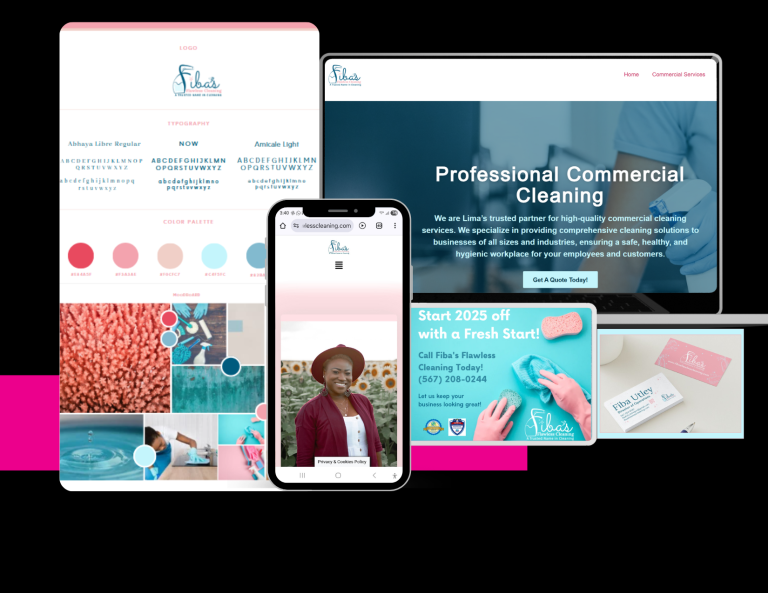
Case Study: Fiba’s Flawless Cleaning– Professional Commercial Cleaning
Client: Fiba’s Flawless Cleaning
Industry: Professional Commercial Cleaning
Tagline: “A trusted name in cleaning..”
Objective: Full Brand Kit Development
The Result
“I was blown away. You took what I didn’t even know how to explain and turned it into something I could be proud of.” – Fiba, Owner
Fiba’s Flawless Cleaning now has a full brand ecosystem that mirrors the care and consistency of their service. From the uniforms to proposals to the website, every piece tells the same story:
Trust. Professionalism. Excellence.